ShopDreamUp AI ArtDreamUp

Deviation Actions


Suggested Deviants


Suggested Collections


You Might Like…


Featured in Groups


Description
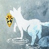
Sketch commission for  ! This is her OC Khalil~
When I was drawing this character, I thought how interesting his name was and how I've never heard of it before, but then I look down at my Task Bar and I see a window opened called "Khalil". I started laughing when I realized that the songs I was listening to, as I drew this drawing, was sung by a great singer called "Khalil Fong" XDD What a coincidence!
Thank you sooo much *KirikaFD for being my first "Online" commissioner! As a gift I did come flat digital coloring on this piece~ Hope you like it ^_^
For more information about this character, please ask KirikaFD, because this is her OC, not mine~
Please check out my FAQ before asking any questions~ (Smile)")


Commission Information | Facebook | Tumblr | FAQ
All your Critique, Comment, Fav and/or +Watch are much appreciated!!
! This is her OC Khalil~ When I was drawing this character, I thought how interesting his name was and how I've never heard of it before, but then I look down at my Task Bar and I see a window opened called "Khalil". I started laughing when I realized that the songs I was listening to, as I drew this drawing, was sung by a great singer called "Khalil Fong" XDD What a coincidence!
Thank you sooo much *KirikaFD for being my first "Online" commissioner! As a gift I did come flat digital coloring on this piece~ Hope you like it ^_^
For more information about this character, please ask KirikaFD, because this is her OC, not mine~
Please check out my FAQ before asking any questions~
Commission Information | Facebook | Tumblr | FAQ
All your Critique, Comment, Fav and/or +Watch are much appreciated!!
Image size
2149x3310px 460.98 KB
© 2010 - 2024 AyumiNazu
Comments24
Join the community to add your comment. Already a deviant? Log In
First of all, very nice work. It's so hard to create a really good and coherant image from someone else's character description. Becuase this isn't your original character I gave you a 4 in originality however a 5 in vision is for your amazing translation of the character into image.
I really like how it still retains anime features such as the hair and eyes but it's in a more realistic form.
I love how everything in this picture is soft, just a little but not too much. For example, the subject's Mona Lisa smile, the subtle pupils that give depth but don't look forced, how the hair falls on the face, the slight position of the brows, it all works very well together. The off centering was a good choice as was the addition of little squares on the right side. It balances the picture out nicely without drawing attention away from the subject. Props also for getting the folds of the hoodie although it they look a little too thin and angular.
One thing I really would like to talk about is shading. I love the shading in the sweatshirt and the choice not to interfere with the white design. If you had tried to shade that part in, it would have been too dark. You missed a lot of places that do need shading though. This includes the shadows on the forehead from the bangs, the collar bones, the nose, the eyes, all need slight shading to tie it with the rest of the person. Also, his hair looks like line art and needs slight shading as well. If you ever revise this image, use the same gentle hand you used for the rest of the picture for the shading in the areas mentioned.
Over all, you did a very good job. I hope the person who commisioned this piece appriciates it as much as they should.